
You must log in or register to comment.
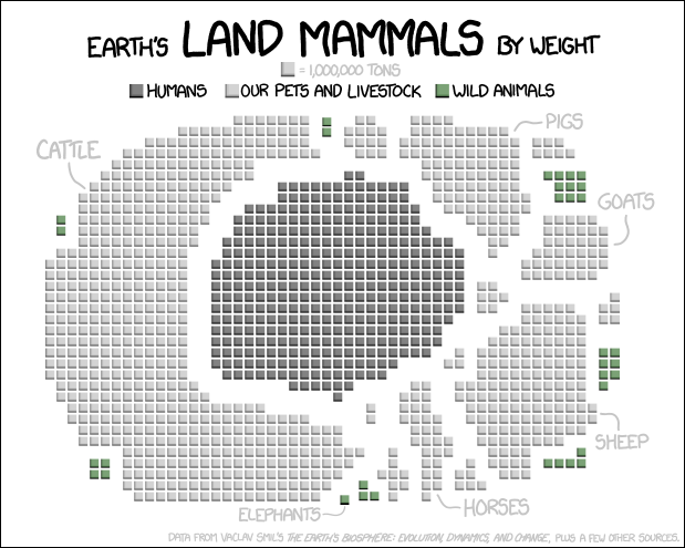
Interesting data, but I don’t think it is beautifully presented. Bar charts, or maybe a blown up pie charts may be easier to grasp the scale.
Blobs of the largely same color, dispersed in a random pattern make it hard to quickly see scale