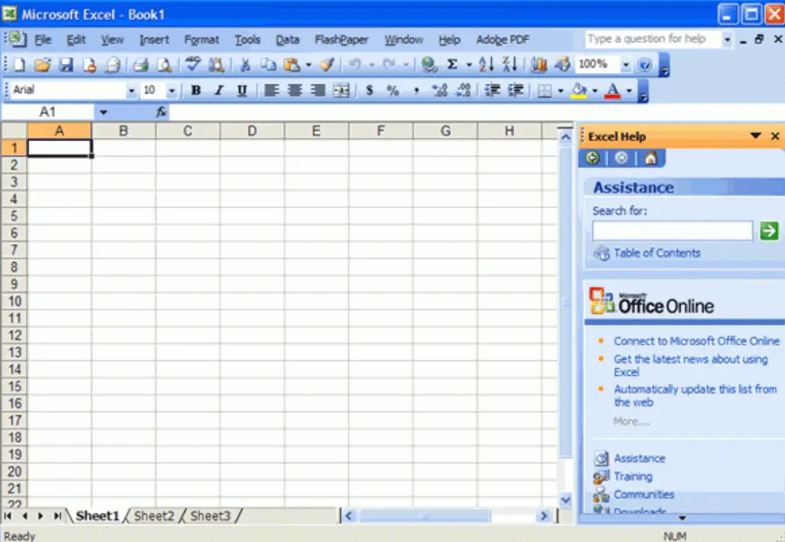
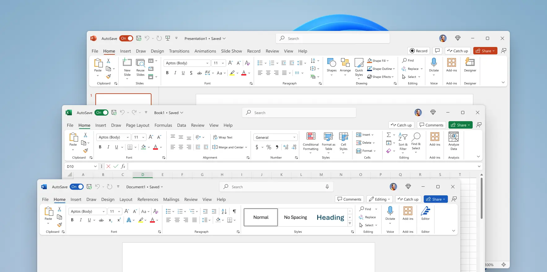
Why did UI’s turn from practical to form over function?
E.g. Office 2003 vs Microsoft 365

It’s easy to remember where everything is with a toolbar and menu bar, which allows access to any option in one click and hold move.

Seriously? Big ribbon and massive padding wasting space, as well as the ribbon being clunky to use.
Why did this happen?


Contrast is Satan to designers, because being able to distinguish the zones of a UI messes with their perfect colour blocking.
Makes me think of people who want to cut down all trees along streets and replace all grass with concrete. So that all would be empty and similar and “in order”.
By the way! I can see how this (color blocking) may resonate with one’s ADHD and the stereotype that many designers have it.
But if any such a designer is reading this, I want them to understand that using their … creations with ADHD is harder, not easier, than using normal, traditional UIs.
For the designer this may be a distracting and irritating contrast, because they have no use for information conveyed by it. For the user it’s the opposite, they are distracted and irritated because of not being able to quickly find what they need.