
1·
1 month agodeleted by creator
deleted by creator
I use the tiles to “pin” programs that I use semi-regularly and can’t be bothered remembering the name of. Or that share an inconveniently long prefix with the name of another program. Or that I have multiple versions of installed, with a specific version I usually need.
I don’t like pinning such programs to the task bar because they add unnecessary clutter while not in use.

It does and you can safely ignore us.
Just two pendants nitpicking people’s spelling on the internet.
!corsicanguppy appeared to imply your spelling of “till” to be incorrect and that the “correct” spelling is “'til”. I pointed them to a dictionary describing the word with the spelling you used and the meaning you intended.
Both comments are inconsequential to your point, and to anything, really.!<
Just in case you’re being serious - this is a joke post. You can see the guard rails behind the bus; it’s not several stories high.

According to a different source shared by @giriinthejungle, the attorney who has taken the case is suing the entire operating unit and expects whoever instructed the girl to drill the hole to be liable for assault. That is also the estimation of the chief regional patient attorney, provided the incident happened as reported by the media.
The neurosurgeon as well as one other doctor have already been let go by the hospital.
Police have not yet charged anyone, their investigation is still ongoing as of the time of the article (2024-08-26).
Absolutely. This game had so much more potential than was realized.
On “the actual
environment/background is not made of Lego” complaint:
while Bricktales looks neat, its “environment/background” is tiny.
For anyone interested in a more Minecraft+LEGO experience, with an actual world made entirely of LEGO that you can interact with, check out LEGO Worlds. (currently 80% off on steam)
That’s quite interesting.
Although it would need access to an already configured and fully functional environment to actually run this.
I don’t think we’re quite at the point yet where it’s able to find the correct script, pass it to the appropriate environment and report the correct answer back to the user.
And I would expect that when integration with external systems like compilers/interpreters is added, extra care would be taken to limit the allocated resources.
Also, when it does become capable of running code itself, how do you know, for a particular prompt, what it ran or if it ran anything at all, and whether it reported the correct answer?
Thanks for responding, that makes a lot of sense.
I think generally what one gets used to has a big impact on preferences.
I’ll say, an easily accessible, reliable gesture for side menu sounds nice. It feels like this was either abandoned on Android or left up to developers who mostly abandoned it. I remember struggling to get the side menu to trigger instead of back navigation and it not working near reliably enough. So I’ve been trained to always use the hamburger buttons that, ironically, are hard to reach in the top left corner in most apps. To be fair, I feel like I hardly use one menu interaction for every 100 back actions, so the latter being ergonomic is a lot more important to me.
On that point, swipe from left to go back seems quite annoying. I go back all the time, and having to move my thumb across the entire screen is a pain. I almost never need to go forward, so having that be the more accessible gesture seems weird. I’ll concede that having a gesture for it at all is useful and Android should add the option.
I never felt like the swipe to go back is too sensitive, and if you accidentally trigger it, you can simply move your finger back towards the edge before letting go to cancel the action. You can also configure the sensitivity in the settings. The feedback that you’re about to trigger the action is probably not as obvious as on iOS though, and likely less elegant.
I think both Android and iOS would do well to let users customize these interactions more to their own needs.
Could you elaborate on the gestures part?
I remember the opposite, having hated navigating my iPhone for work. I specifically remember swipe to go back not working reliably at all (many apps seemed to just ignore it, others I think configured other actions on that gesture - WTF), so I got into the habit of using that stupid little hard to reach, hard to hit, tiny back arrow that at least worked consistently when you managed to hit it.
I’ve been enjoying Android navigation gestures pretty much ever since I found out they existed.
It might have been a user issue in my case with iOS since I didn’t use it as much, and therefore maybe was simply using it wrong/was unaware of better ways. But I don’t see anything wrong/missing with gestures on Android.
Congrats, you’ve just discovered internet memes.
Bonus: good tests can also serve as technical documentation.
Though I have to disagree with the notion that documentation is as important or more so than code.
Documentation is certainly near the top of the list and often undervalued. I’ve worked on a project where documentation was lacking and it was painful to say the least.
Without documentation, changing or adding features can be a nightmare. Investigating bugs and offering support is also very difficult. But without code, you have nothing. No product, no users, no value.
There are (inferior) substitutes for documentation: specialized team knowledge, general technical expertise. These alternative pools of knowledge can be leveraged to create and improve documentation incrementally.
There’s no replacement for the actual functionality of your applications.
Ditto on the no text part. That is an accessibility failure that’s way too widespread.
Sometimes I’m afraid to even push a button: does this delete my thing, or does it do some other irreversible change? Will I be able to tell what it did? Maybe it does something completely different, or maybe I’m lucky and it does in fact perform the action I’m looking for and which in my mind is a no-brainer to include?
And it’s infected interpersonal communication too - people peppering their messages with emojis, even professional communications. It not only looks goofy, but is either redundant (when people just add the emoji together with the word it’s meant to represent - such a bizarre practice) or, worse, ambiguous when the pictogram replaces the word and the recipient(s) can’t make out what it depicts.
The most fun is when it’s a mix - the message contains some emojis with accompanying translation, some without.
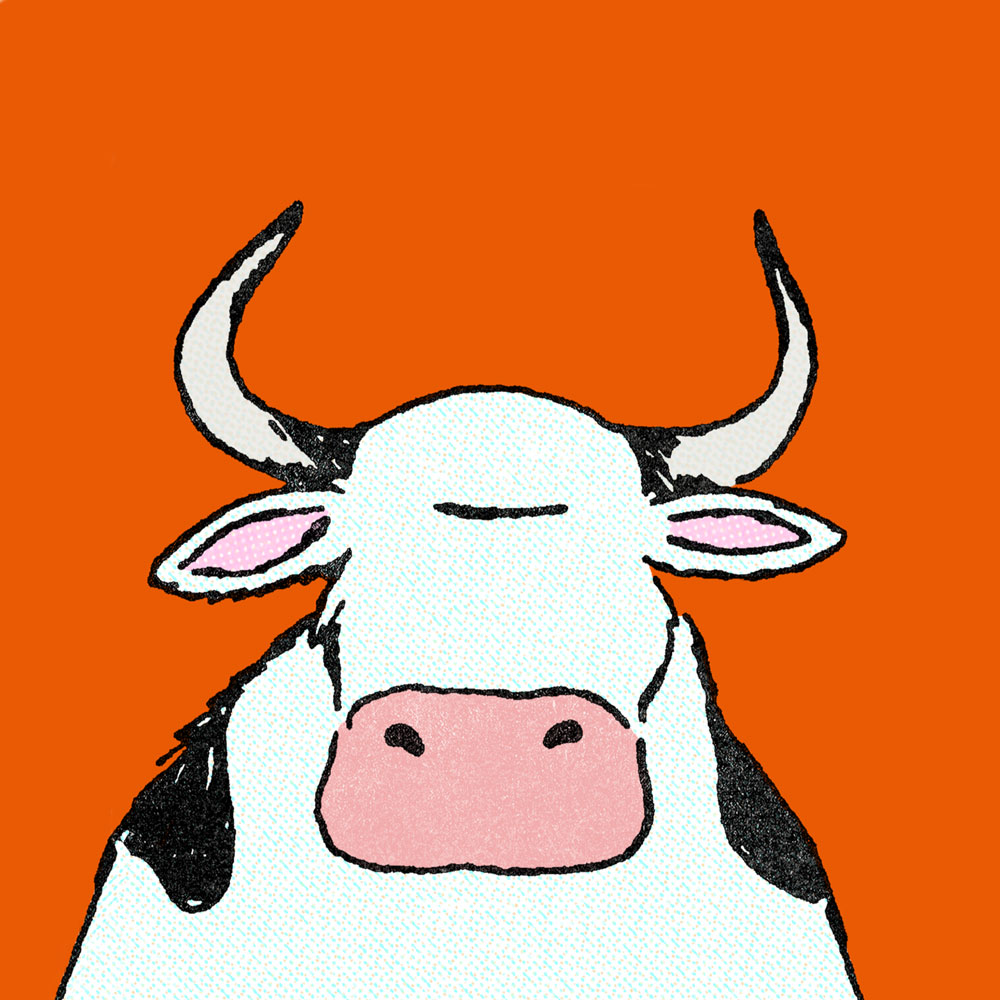
Me every time I see one of these pretty much.
Feels like these are from another timeline. Guess the name is fitting.
If I had to guess, I think this might be poking fun at overprotective parents who unwittingly do more harm than good by controlling their kids’ environment to an unhealthy degree.
Trying to read more into it, perhaps it’s also pointing at the propagation of bad childrearing practices across generations - parent cows grew up on a farm, constrained by an electric fence. Though presumably more independent now, this is what they knew growing up, so they apply (a bizarre perversion of) these same practices to their own children.
I’m probably way off though, because that interpretation barely elicits a half smile from me.
Curious for an explanation from someone who actually gets it too.
I don’t share the hate for flat design.
It’s cleaner than the others, simpler and less distracting. Easier on the eyes, too. It takes itself seriously and does so successfully imo (nice try, aero). It feels professional in a way all the previous eras don’t - they seem almost child-like by comparison.
Modern design cultivates recognizable interactions by following conventions and common design language instead of goofy icons and high contrast colors. To me, modern software interfaces look like tools; the further you go back in time, the more they look like toys.
Old designs can be charming if executed well and in the right context. But I’m glad most things don’t look like they did 30 years ago.
I’m guessing many people associate older designs with the era they belonged to and the internet culture at the time. Perhaps rosy memories of younger days. Contrasting that with the overbearing corporate atmosphere of today and a general sense of a lack of authenticity in digital spaces everywhere, it’s not unreasonable to see flat design as sterile and soulless. But to me it just looks sleek and efficient.
I used to spend hours trying to customize UIs to my liking, nowadays pretty much everything just looks good out of the box.
The one major gripe I have is with the tendency of modern designs to hide interactions behind deeply nested menu hopping. That one feels like an over-correction from the excessively cluttered menus of the past.
That and the fact that there’s way too many “settings” sections and you can never figure out which one has the thing you’re looking for.
P S. The picture did flat design dirty by putting it on white background - we’re living in the era of dark mode!
Love this comment.
Absurd, mysterious, unapologetic.
TLDR:
Nature can’t simply select out consciousness because it emerges from hardware that is useful in other ways. The brain doesn’t waste energy on consciousness, it uses energy for computation, which is useful in a myriad ways.
The usefulness of consciousness from an evolutionary fitness perspective is a tricky question to answer in general terms. An easy intuition might be to look at the utility of pain for the survival of an individual.
I personally think that, ultimately, consciousness is a byproduct of a complex brain. The evolutionary advantage is mainly given by other features enabled by said complexity (generally more sophisticated and adaptable behavior, social interactions, memory, communication, intentional environment manipulation, etc.) and consciousness basically gets a free ride on that already-useful brain.
Species with more complex brains have an easier time adapting to changes in their environment because their brains allow them to change their behavior much faster than random genetic mutations would. This opens up many new ecological niches that simpler organisms wouldn’t be able to fill.
I don’t think nature selects out waste. As long as a species is able to proliferate its genes, it can be as wasteful as it “wants”. It only has to be fit enough, not as fit as possible. E.g. if there’s enough energy available to sustain a complex brain, there’s no pressure to make it more economical by simplifying its function. (And there are many pressures that can be reacted to without mutation when you have a complex brain, so I would guess that, on the whole, evolution in the direction of simpler brains requires stronger pressures than other adaptations)


win + space to switch between keyboard languages
win + tab to open the desktop switcher
win + ctrl + t (if you have PowerToys installed) to prevent other apps from stealing focus from your window