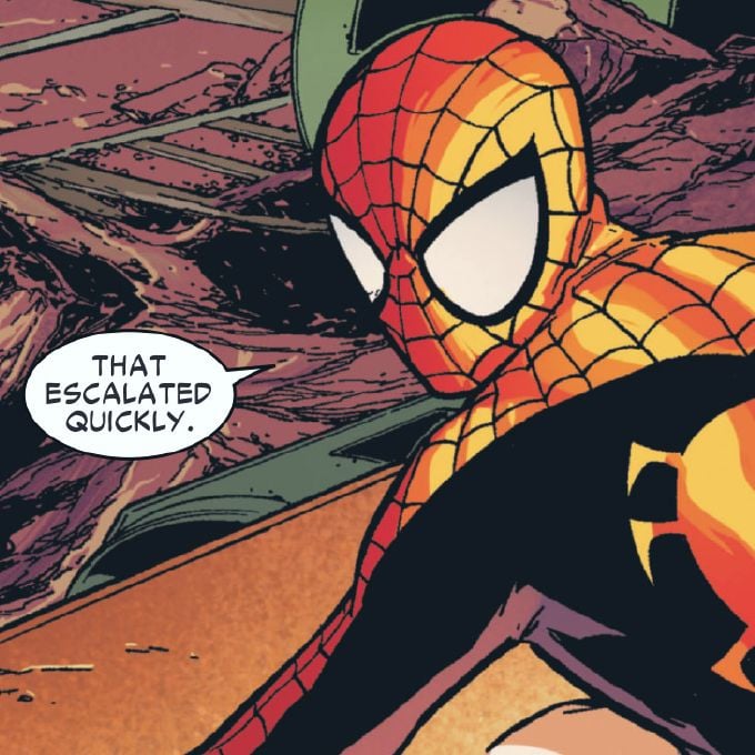
The font is ugly.
Jaguaren’t
Soon there will be no color, no originality.
Just a single font to use everything will be homogeneous and consolidated. Minimal, inoffensive and focused grouped to appeal to everyone and also no one.
Movies, music, games, brands.
A design consultant probably sent Jaguar a six-figure bill for this new logo, you know.
That looks like marketing, let their six-year-old design the logo. Half the letters or lowercase and half are uppercase.
Awh hell nah, no more JAAAAAAAAAAG :(
They’re trying to impress investors with ‘serious’ design, not stand out with a unique one
Nothing says “serious” like mixing upper and lower case letters yet keeping them all the same height, so it looks like a third grader wrote it
Yeah, it DOES look like shit, but tiger-less and safe shit
oversimplifying logoes and stuff makes me rage, especially this
Skoda have done something similar with their latest offering. No Skoda badge, no radiator grill. Just SKODA in a boring font.
Just buy an old style one and replace the new one with it if you just have to have a jag
I read this as joguar when I first scrolled by.
They probably paid 10 million for that and a 12 year old could have made it.
What are they selling now 🙄
Cheap vapes and gucchi knock offs apparently.
“We’re a tech company now!” logo
Slightly misleading without showing the color, only slightly though
What’s the reasoning behind? Or just a trend?
I think it’s just a long-running trend across many different companies towards simplification. Here’s the Apple logo for example:
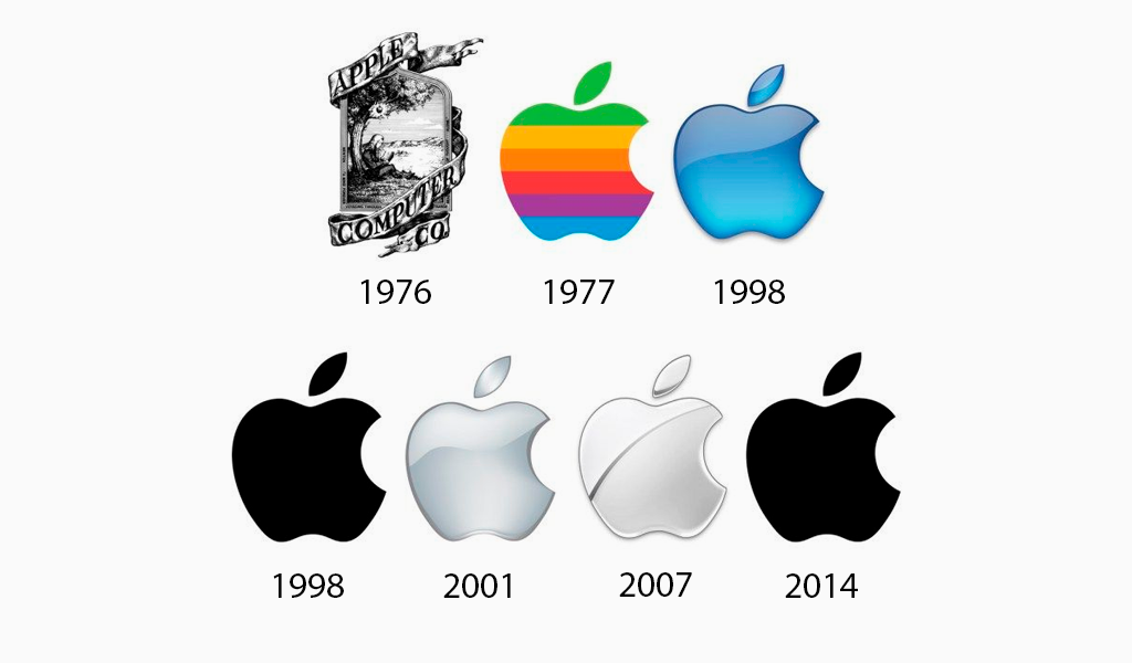
Gotta say, the original Newton logo would’ve looked sick if engraved on the back of a product. Too bad nobody has ever done it.
I don’t see it. In this case, I see basically the same since 1977, or being strict, 1998. Unless they go for just " A P P L E " next. It’s, in my view, a big step to abandon a graphic for letters.
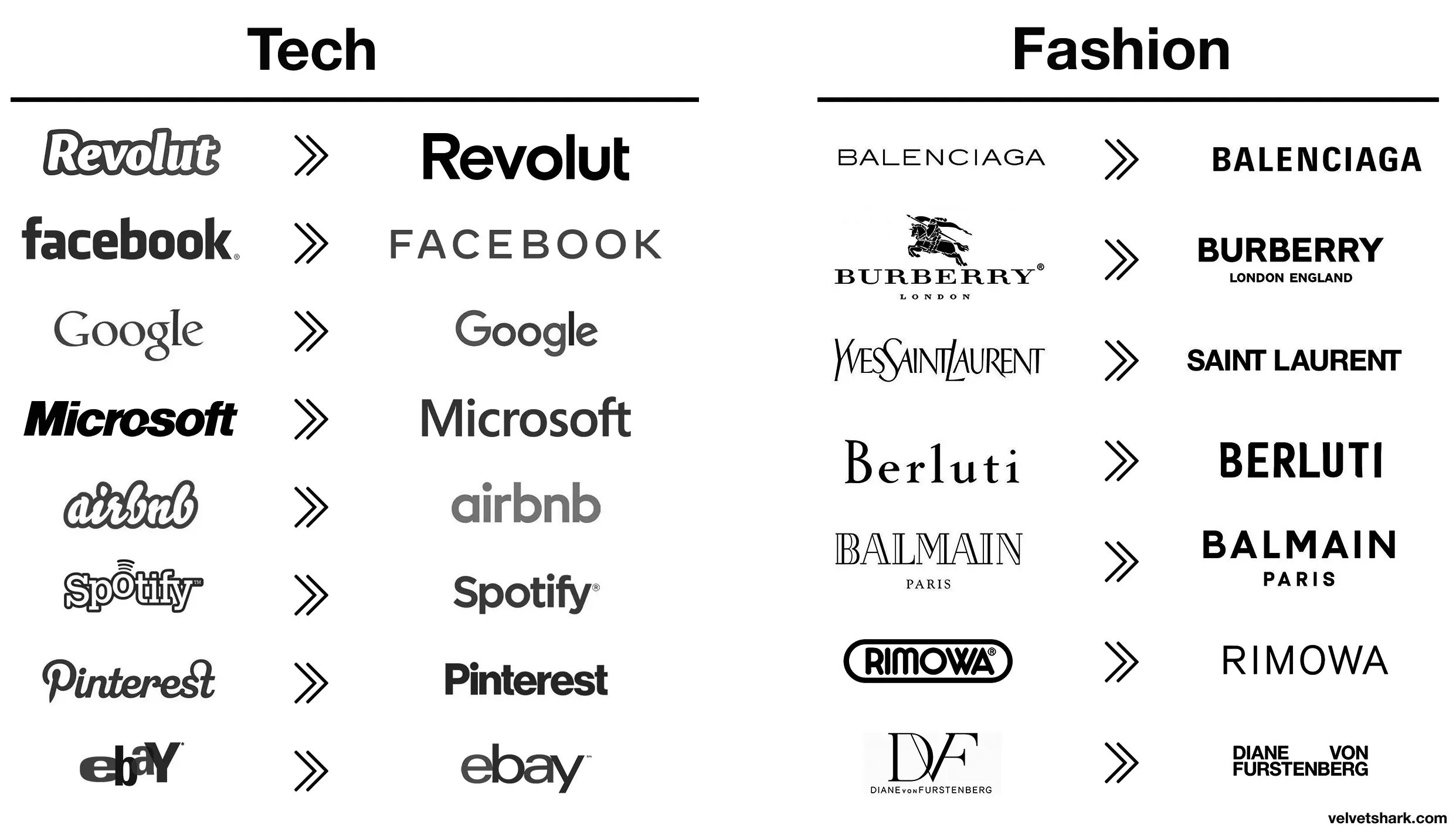
Better:
- Revolut (though a fintech company named after a revolution lacking the charge at the end is still moronic in several ways)
- airbnb (from awful to meh)
- Spotify (same)
Worse:
- Pinterest (original fit the platform and what it is/was pretty much perfectly. Current is meh)
- eBay (both are bad IMO, but at least the original was bad in a playful and eye-catching way. The new one is just more meh
- Burberry (the stag was notable and signalled a history of old-fashioned quality that’s suitably rugged. The new one is meh AND insecure about people knowing which London they’re from)
- Rimova (yet another fashion brand apparently afraid of being noticed
- DF (from one of the best and most fashion-appropriate logos to an absolute eyesore and kerning nightmare that invites vandalism)
- Jaguar (From absolutely iconic and great in every way to even uglier than the new DF one. I hope whomever came up with that got both fired and beaten and I’m a pacifist.)
The rest just go from meh to slightly different meh 🤷
I liked the old aibnb one.
Microsoft went from “boring with a bit of attitude” to just plain boring
Microsoft went from 90s corporate to 10s corporate
DF gets points dedacted for missing the ü dots on both, looks absolutely stupid to a german speaker
Spot on.
Those old fashion logos are actually sick. Concerning that an industry that sells style would make these their logos.
Except eBay, that was always trash.
Their business is literally selling people’s trash so it’s amusingly appropriate lmao
I wonder how much correlation there is between logo blandification and being owned by giant corporations.
All these minimalist labels save .0005¢ every time they’re printed, probably even more on promo booths, banners, and the like.
I think it has more to do with being readable on small screens, like mobile phones. It still doesn’t make sense to me to completely remove your logo and replace it with a sans serif name of your company like jaguar just did.
All the companies are gonna merge over the next decade or so, leaving a handful of megacorporations to lord over our cyberpunk dystopia. It’s just easier if all their logos already look the same.
Aaaah then indeed that makes sense (and this is not ironic).
Oh, I wasn’t being entirely serious, though there is an element of truth to it. It probably is a measurable cost savings over the scale of the business.
I still think these unremarkable corporate logos are boring AF. Just makes them visually soulless along with just being corporate soulless.
I completly agree these logos are boring. The brand lost so much character and flare.
However I totally see “cost less” as one of the reason why these changes were pushed (especially for clothing brands).
Spotify and EBay made the right choices here, the new logos are way better.
It is subjective, I like the old eBay logo more, but dislike the old Airbnb one.
Well, they certainly fin in better with all the others.
